Jamtrak website has been long gone, and the last 2 designs look dated. How can I update the design? First, I have to objectively look at what’s wrong with the past 2 designs before I can make it better.
2011 Jamtrak Design Critique, 2020

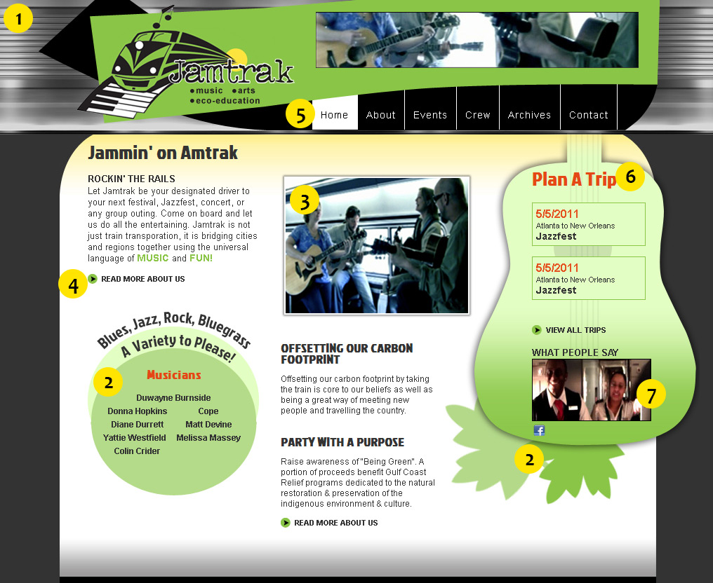
- I always liked the metal treatment in the background, and how it reminds me of a piece of train exterior (just a bit?). If I wanted to keep that, it would have to be converted to an svg image for the interest of page speed.
- What are those leaves? What is that? How does it relate to a guitar? It doesn’t, and it looks weird. Loose the leaves. Also, the circles with rounded text around it serves what purpose? How do circles support our topic here? Lose the circles too. These 2 pieces of art make the design over-worked or over-designed.
- Images are not high quality. While we could get away with this in 2011 by providing small-sized media, this does not hold true today. Images and video resolution today needs to be higher.
- Oh the eternal circle with arrow! The quintessential way to tell the user, “hey, there’s more!”. While this tactic is still used today, the hit target of the link(s) need to be touch-friendly for today’s touch devices. This will need to be bigger (minimum 44px).
- Does Jamtrak really need 6 pages of information about it? This site could easily go to the 1-page, long-scroll design that could possibly eliminate the need for such a traditional, horizontal, straight line navigation. I will say that I always loved the black/white buttons to mimic the keys of a piano. I also like the how the green and black stripes cross because it reminds me of train tracks… except in the very corner of where it overlaps with the logo.
- A guitar shape is applicable to the overall theme of music on the train, but the callouts on the guitar is to plan a trip… or is it? WHAT IS THE CALL TO ACTION? There is no indication that clicking on the event details would take you to the “buy tickets” feature! The guitar shape should be used more in conjunction with featured musicians, not trip details.
- This is a great testimonial video taken right on the train, but a user would not know this… there is no indication to play it or that it is even a video at all.
In summary, the 2011 design was slightly over-designed, leaving the user with no clear information hierarchy. The user would not even know where to click to buy tickets. This site was implemented an HTML website.
2014 Jamtrack Design Critique, 2020
The 2014 site switched to a WordPress website with a simplified design that concentrated more on content for SEO value, and less about the design. This design is slightly under-designed, visually speaking.

- The word “JAMTRAK” in the header is following best practices for <h1> placement. How do I keep that but look visually interesting?
- We have a call to action to “Buy Jamtrak Train Ticket”, but the color contrast is lack-luster and it still does not even look clickable.
- Highlighting that “Amtrak is cooler friendly” should be more of a call out and have a different treatment on the text.
- Placement of “Announcements” takes up prime above-the-fold real estate without bringing any visual interest to the party. Use that real estate to bring more visual interest
2020 Redesign is Not Happening
The 2020 design will address these points, and hopefully be a version in between the 2011 over-design and the 2014 slightly under-design. It should make good use of the above the fold real estate with a clear call to action that looks clickable.
The Jamtrak website has a lack of assets, making it more difficult to work on. I am not going to work on this dead project in favor of another project with more potential. (Move on to start the Carnival project instead).
I found more Jamtrak footage! https://youtu.be/VN5mz6n768Y