Website design that I really like for the following reasons:
Incredible use of white space. As we scroll down the page the eye can rest between the information blocks. The white space helps separate.
The usage of the vertical dotted line down the page. I know we’ve seen this before, but I have always liked it. It helps tie the information blocks together in a sequence down the page. The dotted line helps unite.
The color scheme is clear. Repeated usage of the 4 predominant colors is matched to each section of information. This helps the user stay oriented on where they are in the information architecture.
The animated flip action on the drop down in the main nav. The animation is only on hover on the desktop, and not on the touch menu on the phone. Thoughtful consideration here was implemented to not have animations performed on a cellular network. Thanks!
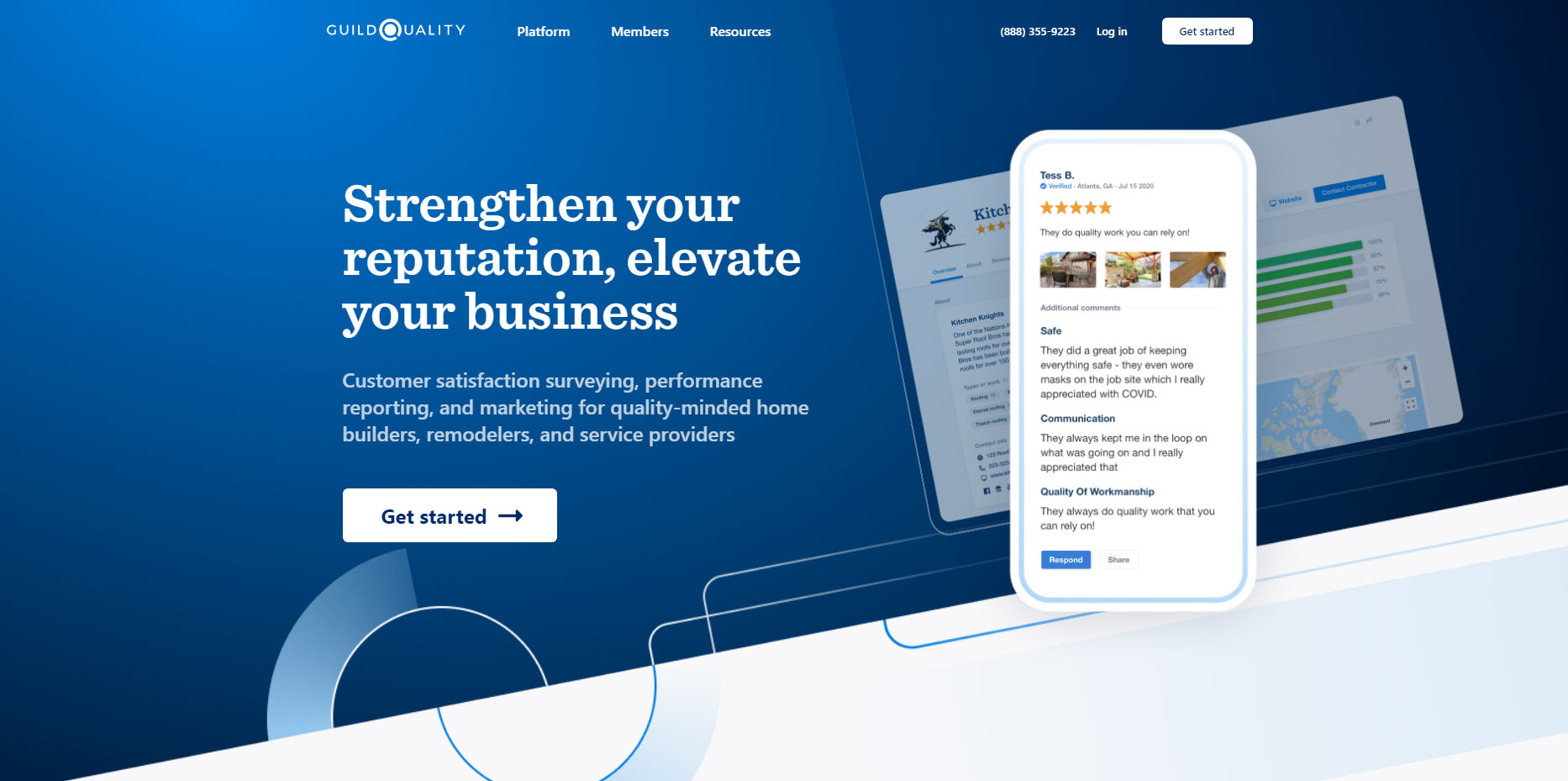
The animation of the phone graphic. Not everybody is going to see this, but the phone graphic floats into place when I resize the browser window. Maybe this wasn’t even intentional? I don’t care, I like it anyway. Us developers like to resize windows.
The hover treatment on the call-to-action buttons. A very slight color/opacity change happens, but that’s not all. In case you are color blind or don’t notice the subtle nature of the color change, the arrow is also slightly animated on hover, so ALL people (well seeing and vision impaired) can enjoy the hover.
Gradients are back! Thank you for heaven’s sake, we have a rich, blue gradient background instead of the tired flat-color background.
The angle of the graphic at the bottom of the featured hero area. The way the graphics repeat the dotted lines. LOOK CAREFLULLY at the home page circles the look slightly like targets with as call-to-action button in the middle…. those color circles outside the centered target are MOVING ever so slightly. Why? Because, why not? It gives the design a little bit of life and an organic feeling to it.
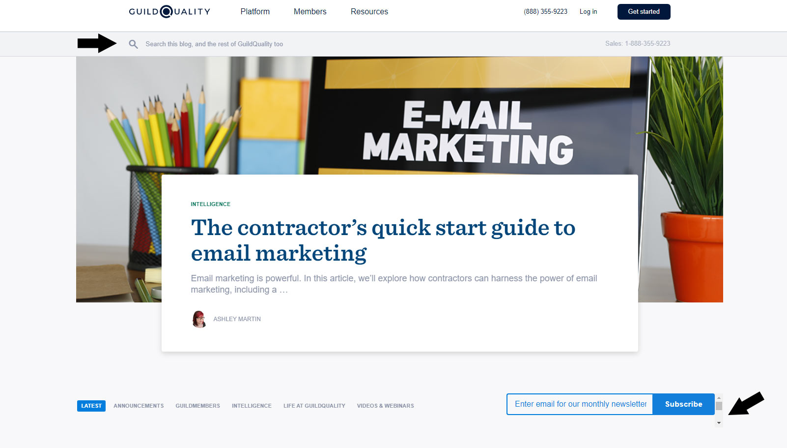
The blog page treatment of the article thumbnails and usage of cards. There are at least 3 different sizes of images used for these cards that look perfectly at any responsive size. The entire card is clickable, not just some linked text in the card. I also like the tiny author thumbnail.
Ooopps, this is not a perfect website. The email signup on the blog page is in a weird inner scroll window, obviously a flaw.
Ooopps, the search box on the blog page was really hard to find.
Yea for a beautiful user sitemap that is grouped by category.
Overall this site is simple with a strong use of whitespace and it uses color and animation most appropriately in a way to give the user more meaning of the information.