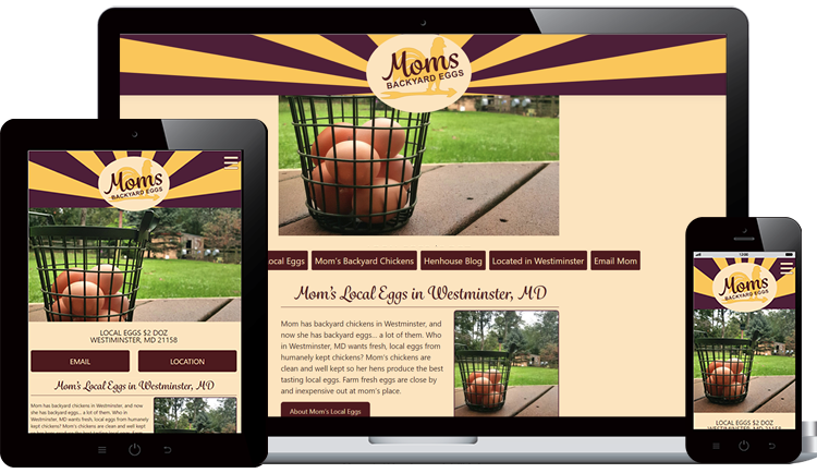
Here are the possible designs for the mobile version of the website. I always design the mobile version first, and this will help narrow the design decisions before moving on to tablet and desktop designs. I include SEO elements into my design, such as the text “Westminster, MD 21158” to capitalize on local search opportunities. This text will be indexed by search engines and improve findability if a user were to search for “local eggs in Westiminster” or “eggs 21158”. Most of all, it will help users quickly see if Mom’s is close to them or not. I’m also considering the usage of an “inventory indicator” because I anticipate that will be one of the most frequently asked questions.
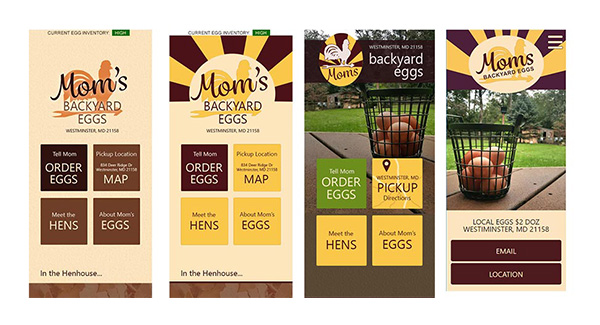
#1 – The Brown Egg Comp – you will see these neutral colors in the wireframe. I liked the natural colors and put a little more polish on the design by adding a background texture that reminds me of the chicken feed. Posts are styled with a light brown color that overlays the featured photo to mute down the colors and bring it into that brown-egg color pallet. This was just a starting point.
#2 – Retro Sunburst – this gives the design more colors and reminds me of advertising. The sunburst in the background is a very typical design that is frequently used with chicken artwork. Okay, I know this is a rooster, but the average person doesn’t know that. I was extremely happy with the effect of the sunburst, but felt it lacked what the “real flavor” of Mom’s Eggs.
#3 – Actual photo of mom’s backyard with eggs in basket. This design retains the illustrated sunburst logo in an oval egg shape and combines it with the realism of the photo. The photo lets the user see directly into mom’s backyard and chicken coop off in the distance. I felt the oval containing the sunburst diminished it’s effect. Also it felt like there were too many choices being presented (navigational squares)
#4 – The winning design retains the impact of the sunburst, and combines it with the photo of Mom’s porch with hen house in the background. Callouts are slimmed down to just “Email” and “Location” so we don’t overwhelm the user.