I used 5 users for the first round of testing.
The users were employees of the company producing the app, but the users were not involved in building this project and had no insight about what the project was, looked like, or what it was supposed to do. They are representing our typical user. The users were asked to perform certain tasks and I asked question about how they felt about it. Tasks were to measure the ease or difficulty of performing fundamental tasks of the app such as the signup process, taking surveys, and making a doctor’s appointment
Testing questions & tasks
- When looking at the home page, what is this? What do you think you are supposed to do?
- Sign up
- Does the user understand the dashboard (after signing up)? Do you know where you are or what can you do here?
- Make an appointment with a doctor
- Does the user understand the dashboard (after making appointment with doctor)? Do you understand where you are?
User testing videos
User testing is videoed for later analysis and measuring how long each user takes for each task, thus allowing the results to be quantifiable.
- Healthcare app usertesting 1
- Healthcare app usertesting 2
- Healthcare app usertesting 3
- Healthcare app usertesting 4
- Healthcare app usertesting 5
Findings of Rapid Prototype
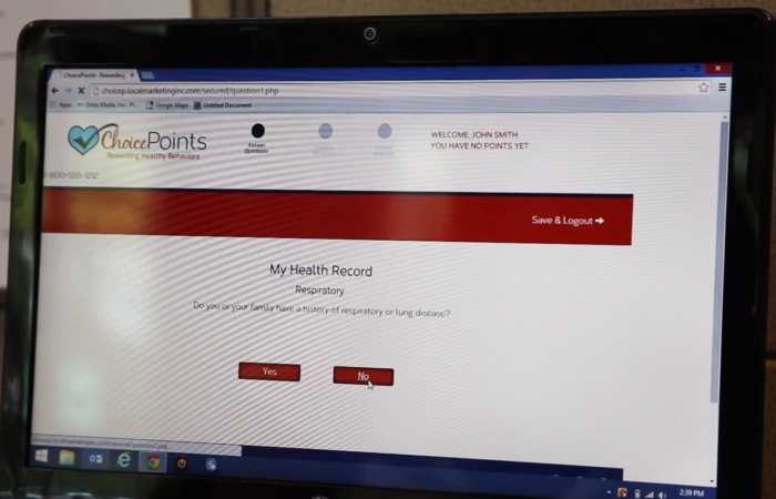
![]() Survey questions: The app did a satisfactory job administering the survey questions using progressive disclosure and a 1 touch method of answering. No users had any problems with answering questions.
Survey questions: The app did a satisfactory job administering the survey questions using progressive disclosure and a 1 touch method of answering. No users had any problems with answering questions.
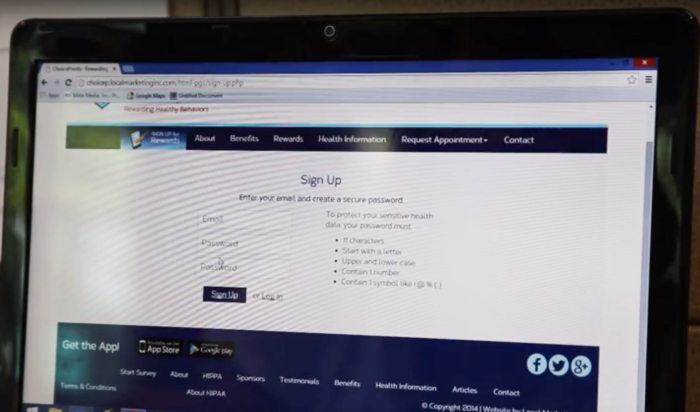
![]() Signup process: The signup process was interpreted by the users as intended. Each user was able to successfully signup.
Signup process: The signup process was interpreted by the users as intended. Each user was able to successfully signup.
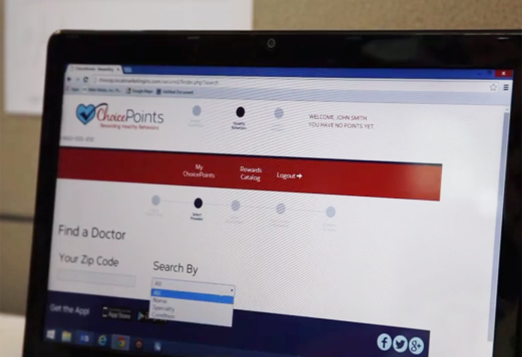
![]() Make Doctor’s Appointment: Users had difficulty with the physician finder when requesting a doctor’s appointment. There were too many options for the search that left the users confused on what to click on. This proposed solution was over engineered for the project objective.
Make Doctor’s Appointment: Users had difficulty with the physician finder when requesting a doctor’s appointment. There were too many options for the search that left the users confused on what to click on. This proposed solution was over engineered for the project objective.
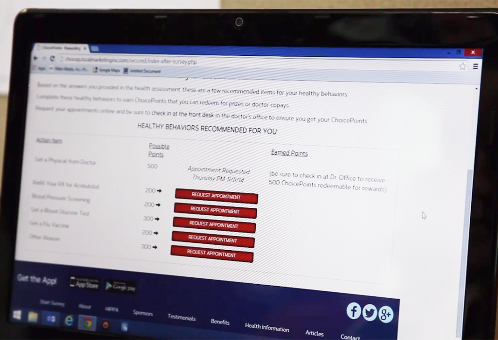
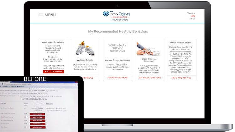
![]() Dashboard: The dashboard presenting the recommended healthy behaviors was lackluster, as evidenced by the users reactions to questions such as “does anything stand out here?” and the answer a repeated “no”. This qualitative data prompted a dashboard redesign. The dashboard only offered interaction as it related to requesting another doctor’s appointment.
Dashboard: The dashboard presenting the recommended healthy behaviors was lackluster, as evidenced by the users reactions to questions such as “does anything stand out here?” and the answer a repeated “no”. This qualitative data prompted a dashboard redesign. The dashboard only offered interaction as it related to requesting another doctor’s appointment.
ACTIONS TAKEN
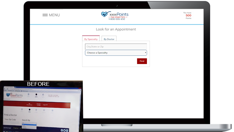
Revised “Make Appointment”
Revisions in the prototype included moving the “make appointment” feature to the unsecured portion of the site so users would not have to be forced to signup or login if requesting an appointment. The physician finder was over engineered, and was trimmed down from 5 steps to 3.