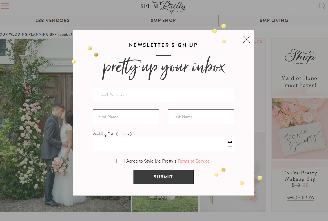
I ran across this on Pinterest. I am not a big fan of interstitials for email signup before I can even look at content. I actually hate them. How dare you ask me to signup for email when I can’t even see your content yet? How do I know I even like you?
I liked the style of this one, so I am including it in my inspiration.
The reason it caught my eye is because it said “Pretty up your inbox” and I thought that was great marketing. I also like the style and aesthetics of the little dots or bubbles, and how it breaks across the lines of the normal signup box/form.
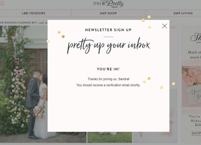
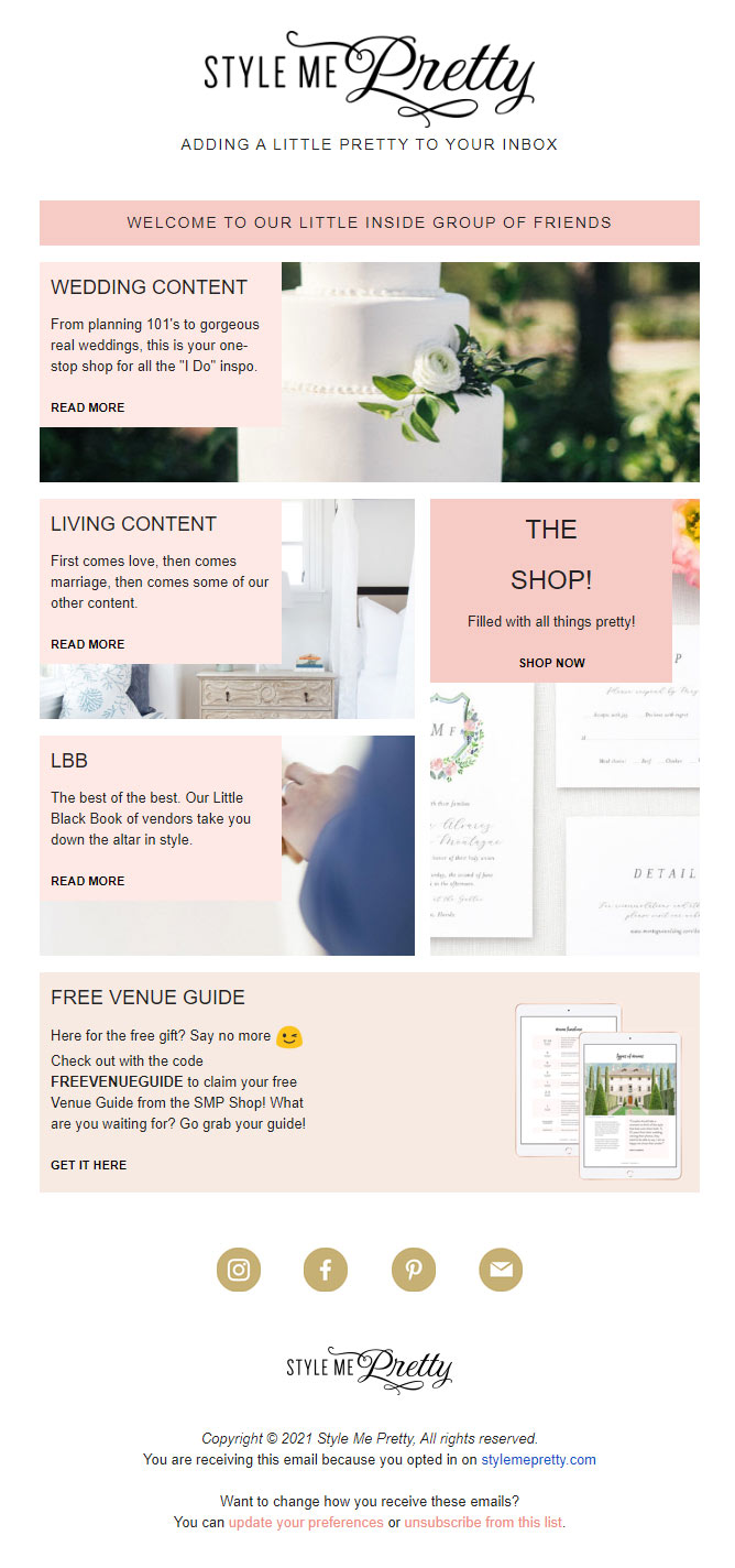
*update: I signed up for the email because I was interested in the design that I would receive in my inbox, and boy they didn’t disappoint! It was beautiful and flawless. Kudos to them for following the proper email procedures by using MailChimp. I was verified as human, and double opted in to make sure I really did want to be on this email list. Beautifully branded too, I didn’t even know it was MailChimp until I clicked update preferences… and even then the only clue was the favicon in the browser tab. Here is a screenshot of the email that I am keeping for future email inspiration.