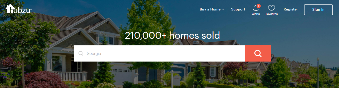
For the first time (ever) I visited the Hubzu website and without thinking about it, I habitually clicked the “alerts” notification icon in the upper right corner. Why did I do that?

We’ve all seen that type of UI on financial dashboards, linking to some personal information, but here at Hubzu I’m not logged in, so I couldn’t of had any “alerts”. I clicked it anyway to eliminate that status number of “1” unread item. Because. It’s one… and unread. That’s why.
Now of course when I clicked it there was no personal information revealed, but what it did present me with was “Why Register”. This message is revealed at just the right moment, as I, the user, by way of clicking, am saying, “I want to engage with your business.” And the response was a perfectly timed, perfectly sized, registration form that slid out from the side.

How to Improve Form?
First, if I clicked an icon called “Alerts”, then that resulting modal box should be labeled “Alerts”, not “Notifications”. It reassures me that I’m in the right place.
Second, if you want me to do something (register) then tell me so: “Register Now”. Listing the benefits of registering tells me why, but the text was too small and too long. Added check-mark icons subliminally helps reinforce the message.
Last, find a way to highlight the benefit “receive alerts”, because you know I just clicked on the alert icon.

Because it’s Good
Overall I’m here and talking about this because I really liked how the website presented information, and it’s obvious to me that a talented team has worked on caring about usability.
That’s the kind of team I like.