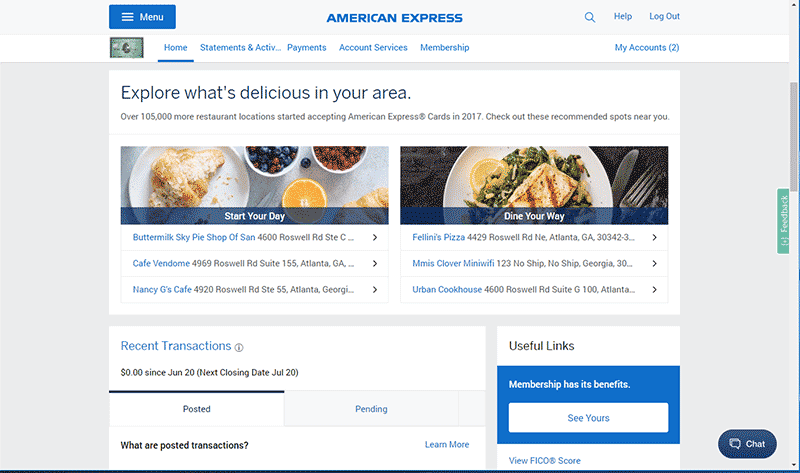
While checking my account at American Express, they offer a hamburger icon in the upper left corner and instead of a typical drop down effect, the menu goes full screen. I thought this is an elegant way to show a plethora of navigation links.
Usually when something hi-jacks my entire screen, it’s not considered a good user experience. Why does it work here?
The answer is rooted in the top row. That’s just it… it’s rooted. The top bar holding the menu button never moves, the text never moves, and the menu button itself never moves. Having these items at the top anchored in the exact same place lends a feeling of orientation to the user.
I additionally like the menu button itself doubles as the “x” close button, which is conventionally on the right. Why does this work? Again, the button is stationery, so the point of entry is also the user’s point of exit. That works.