I don’t really read The Atlantic, but when a friend sent me an article I couldn’t even read the article because I was mesmerized by the beautiful design of this magazine website. Here are some thoughts on this design:
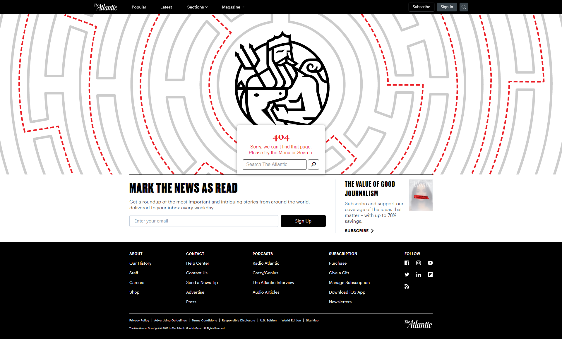
Check out the custom 404 page. Some real thought went into designing this page. The image of the Labyrinth is genius. When a user gets a 404, this might be what we feel like… trying to navigate content only to be confronted with a dead end, having to turn around and start over. (random, I didn’t know there were so many terms for maze terminology: http://amazeingart.com/maze-faqs/maze-terms.html)
 The speed! The fast, instant loading makes me look under the hood. Great attention to detail is spent on optimizing the page. You might think page speed is achieved by loading less code, but nope. It is actually achieved by adding more to it. The old standard used to be that we kept all the resources on separate files for better file organization… a file for fonts, a file for styling, a file for JavaScript, etc. Today’s new standard is to paste ALL resources needed directly into the HTML page, right along with the content. Mash that stuff ALL TOGETHER! Why? So the browser doesn’t have to keep calling back to the server to grab yet another file. One call, that’s all!
While the page speed score clocks in at a mere 47, what makes this page feel so fast is the first meaningful paint. All the page’s resources are loaded at the same time as the content, so the page doesn’t have to travel to get it’s resources loaded up. Also when you view the page source, a lot of white space has been eliminated. This is call minifying, and it’s why the code looks all jammed together.
I like how the navigation works… none of that old-style hover drop-down stuff! Just click it if you want it… none of that lingering around stuff. There is no hover on mobile, so why not make the desktop experience the same as mobile? When you share the same experience on mobile and desktop, you can share the same code base too, so no extra coding required.
A web page that starts with great visual design (like the 404 page for example) and adds on great optimization methods like discussed, makes for an enjoyable user experience.