
This usability study was conducted on the physician finder tool for a major HMO company. The goal was to measure the amount of ease or difficulty users experience while performing searches for providers. Video footage is used to collect data, draw conclusions, and make recommendations to the existing site.
A focus group was conducted to discuss issues with online websites in general.
Executive Summary
Findings and recommendations to improve the site were to limit the number of fields on the search criteria because users were unknowingly narrowing their searches by entering too much demographic information at the beginning of the search. (See task #1). Users also failed to locate the refine search option on the search results page, so it is recommended that the option be moved to the front of the search criteria; this is where users expect to see it. (See task #2). Users failed to locate mammography services because it is located in a specialty category called “Other Services”. (See task #6) It is recommended to add an indicator for mammography services on the imaging center record because this is where the users look for it. Despite a complete video tutorial, users were unable to locate the Hospital Comparison Tool. Recommendations are to clearly indicate in writing that the user must logon to the secured portal to access it.(See task #5).
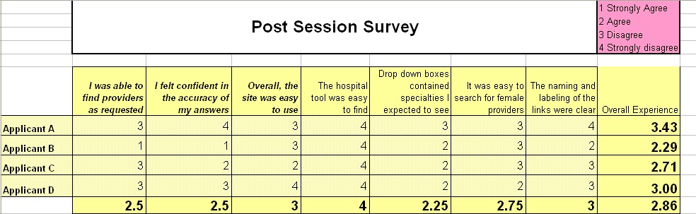
Users say they love the HMO website. They have trouble, though, extracting specific pieces of information and often resort to calling the customer service department. Regarding the tasks they were asked to perform, overall on a scale of 1 (satisfied) to 4 (most dissatisfied) users were generally dissatisfied with a score of 2.86. (See Post Survery and Demographic Results)
Goals, Concerns, Metrics
- Can user perform task in the least amount of clicks?
- Can user perform task in under 3 minutes?
- Will the user think the site easy to navigate?
- Capture user reactions on video tape
The company’s web presence and data warehousing has evolved into a complex, highly sophisticated system. Through this sophistication comes expanded customer service via the numerous portals available on HMO’s website. I needed an accurate measurement of how successful the Physician Finder really was.
The goal of this evaluation was to validate recent comments by the HMO’s employees about the complexity of Physician Finder. A variety of tasks were chosen to fully explore different sections of the Physician Finder website. A usability study was performed during May 18 – 24, 2006, with participants that were HMO employees; three out of four employees participating do not use Physician Finder as part of their job function.
Goals equate to real life task scenarios. These scenarios will be performed by the participants while being observed. Observations will be tallied into qualitative and quantitative data that will be compared to the needs of the user and draw conclusions on how helpful the HMO’s Physician Finder website is to users. The following usability goals will be examined:
- Site structure and labeling are clear and intuitive
- Conduct one-on-one usability tests to determine if the site is easy enough to locate specific physicians in their designated health plan
- Evaluate user behavior with the hospital comparison tool
Concerns
| Value Proposition |
|
|
| Tasks |
|
|
| Hospital Tool (feature located on secure site only) |
|
|
Metrics
Testing is designed to gather both quantitative data (statistics) and qualitative data (comments, reactions). The following were used in this test:
- User will fill out demographic survey
- Observe users performing tasks (quantitative) and document any relevant information including emotions and comments (qualitative). Measurements will include:
- Observations of the tasks with video tape (quantitative)
- Number of mouse clicks (quantitative)
- Time spent on task (quantitative)
- Open-ended questions (qualitative)
- User Demographics (qualitative)
- Post questionnaire (qualitative), ask users open ended questions about the experience (qualitative) in a post questionnaire
Methodology
SELECTING PARTICIPANTS
Participants are limited to employees who do not traditionally use physician finder as part of their job function. This should represent the average user. Three participants represent the average, non-employed user. One participant is a slightly above average user. Two users visit Physician Finder daily, one user visits less than once per month, and one user had never visited the Physician dinfer before. Criteria concerning sex, age, or general internet experience was not a factor in determining participants.
THINK ALOUD APPROACH
Participants were encouraged to talk through the cognitive process. This allows for capturing the thoughts and feelings contributing to the collection of qualitative data.
Pre-Evaluation: User fills out demographic survey
Evaluation: User completes tasks
Post-Evaluation: User fills out survey indicating the quality of the user’s experience
PRE-EVALUATION PHASE (10 MINUTES)
As participants arrived, an attempt was made to make them feel at ease and to assure them that they are not the ones being tested; there were no right or wrong answers. Only the website was being reviewed and that their input would be viewed as an aggregate answer.
Users are asked to fill out the demographic survey and sign the consent form that informs them the session is videotaped for educational purposes and the evaluation is on the functionality of the website, not an evaluation of the user’s intelligence. Every effort is made to make the user feel relaxed and that their opinion is valued.
EVALUATION PHASE (30 MINUTES)
One-on-one evaluation was conducted by Sandy Nichols, HMO Employee of 10 years. Testing was conducted one-on-one in an office with two cameras used. The facilitator gave a brief overview of the site and warm up the user with some general questions about the site:
What is your initial impression?
Is it clear where to begin looking for a physician?
This encourages the user to start talking, and the facilitator encourages the user to think aloud while performing tasks.
Two cameras were used. One captured the expressions of the users and was used to produce the qualitative data. The second camera captured the users screen, and was used to calculate quantitative data like # of clicks and time-on-task.
POST-EVALUATION PHASE (10 MINUTES)
After the tasks were completed, a series of questions were asked to find out the overall experience. Questions included:
What were your difficulties?
Did you accomplish the tasks like you expected?
Did the terms and labels clearly represent what was on the page?
Besides the post-evaluation survey, the user was given a chance to further clarify the reasoning for certain behavior. This could be valuable insight about the user’s experience, and is recorded as qualitative data.
User is thanked for his/her time and input.
Upon completion of the usability testing, each participant received a $10 gift card to Panera Bread Company.
Tasks and Findings
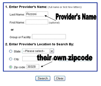
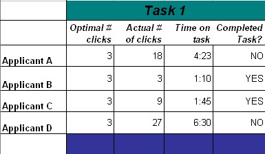
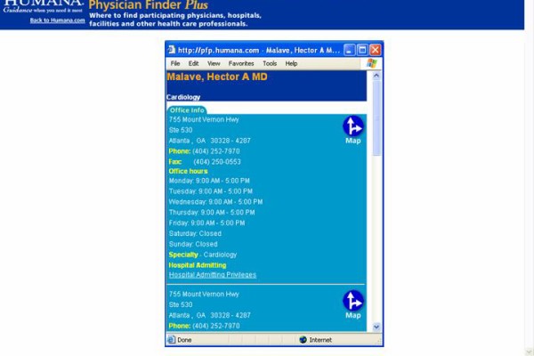
TASK 1: IS DR. RIZZONI IN YOUR HMO PLAN?
The objective of this question was to see if users could distinguish what plans the provider participates in. Some providers participate in the HMO plan, and some providers participate only in the PPO plan. Knowing the difference is crucial to answering the question “is the doc in my network?” In other words, you have to know which network your enrolled in, and pick physicians only in that network. This is a confusing concept, and there was high anticipation that the users would have trouble picking the correct network.
The results of this task show an entirely different problem. Users never found Dr. Walter Rizzoni at all, much less to determine he participates only with the PPO plan.
Unexpectedly, the users could not find Dr. Rizzoni in ANY plan participating with Humana. Even the daily user of PFP failed to locate Dr. Rizzoni. When given only the name of the provider, users did not think to search for the name and state only. On the search by name screen, users put in the doctors name “Rizzoni” and then followed it up with entering their own zip code of 30328. This action forced the search engine to look for Rizzoni in only that zip code, thereby users unknowingly limited their search.
A common mistake on current PFP search options:
QUANTITATIVE DATA
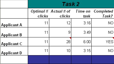
TASK 2: HOW MANY FEMALE OBGYN’S ARE THERE IN ZIP CODE 30328?
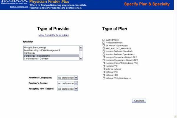
The current PFP has a way to sort for female providers. It is a “refine search” featured after the results are returned. This forces user to perform the initial search, then have to search again from the results screen. All users failed to recognize the need for a second search. Despite the animated magnifying glass, this option was totally overlooked and all four users resorted to guessing which physicians were female by counting the names on the screen.
QUANTITATIVE DATA
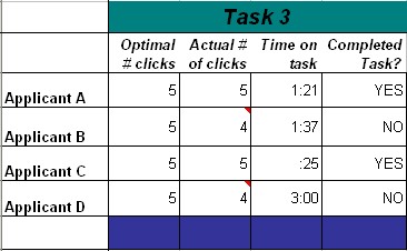
TASK 3: YOUR CHILD FELL OFF THE SWING AND BUSTED THEIR CHIN AND NEEDS A STITCH. WHERE WOULD YOU TAKE THEM?
This question is an attempt to see how educated the users are on the availability of alternate care outside an ER, and to see if they would choose an urgent care facility over the hospital. Recent educational campaigns have been targeted to Humana members to inform them about the availability of urgent care centers and how the lower cost of these urgent care centers directly benefits them.
Answers ranged from the “ER”, to their “PCP”, to “probably an urgent care center but depends on how bad the bleeding is”. two out of four participants chose an urgent care facility with PFP. However, all concluded that they would NOT use PFP to find an urgent care center simply due to the fact that as parents with a bleeding child, theysimply would not take the time to get online and struggle through a physician finder. Some terminated the task.
Due to the nature of this question, no suggestions are offered to improve user interaction with searching urgent care centers on PFP. The current labeling of urgent care in the dropdown specialty box is clear. Marketing efforts outside the website to educate the consumer on urgent care should continue.
QUANTITATIVE DATA
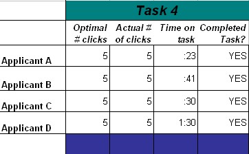
TASK 4: WHAT HOSPITAL IS CLOSEST TO YOU (IN ZIP 30328)?
Every user performed this task flawlessly. There were absolutely no variations from user to user; every participant found Northside Hospital in the optimal # of clicks
This can be credited to the fact that users are not trying to search for any provider by name. It is clear to them that they are to put in their own demographic data and pick the first hospital in the list (default results are sorted by mileage with closest hospital at the top).
This is further proof that any confusion on searching for a provider stems from the name search, not from a demographic search.
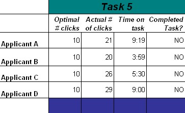
TASK 5: LOCATE THE HOSPITAL COMPARISON TOOL
Although they enjoyed the demo, not one person correctly interpreted the instructions on how to access the actual tool itself. Every user overlooked the fact that they needed to logon to the secured portion of the website to use the tool.
Users commented that they “do not have the patience” to sit through the tutorial. Others clicked on the demo to see that it was just the demo, then quickly backed out and continued to hunt and peck looking for the hospital comparison tool.
Those that did observe the demo extremely liked it (it’s fully animated) and made comments like “oh, I didn’t know we had that”, “I’ve never seen this”, and “I’ve never used this”. Expressions were animated and heads nodded…
Here are some positive reactions to the demo tool:
After closing the demo, users went straight back to the public physician finder in an attempt to use the tool. Even though the demo told them in an audible voice to “logon to myHumana”, users failed to do so. The general population is not allowed to use the hospital comparison tool. Every user traced their steps back through the public PFP expecting to see the “compare hospitals” link that was shown to them in the demo.
To further complicate the issue, the public PFP and the myHumana PFP look exactly the same. Therefore, the screen prints in the demo look exactly like the public PFP. There is no visual clue for the user that they are not in the same place as what was shown in the demo.
Users concluded that the hospital comparison tool was simply not available.
QUANTITATIVE DATA
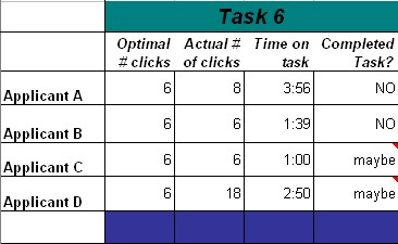
TASK 6: WHERE WOULD YOU GO TO GET A MAMMOGRAM?
There was wide interpretation of this question with users looking for OBs, PCPs, Hospitals, and imaging centers.The correct place to find “Mammography Center” is located in “Other services”.
Reasons for not locating this option vary. Some users simply did not think to look under “other services”. If they did click on “other services” they went straight to the imaging centers. Mammograms are certainly performed in an imaging center, but not all imaging centers perform mammograms.
When asked how they knew that the center performed mammograms, the answer was that they would have to call the center to see if this service is performed.
QUANTITATIVE DATA
POST SURVEY AND DEMOGRAPHIC RESULTS
Concerning this survey, overall on a scale of 1 (satisfied) to 4 (most dissatisfied) users were generally dissatisfied with a score of 2.86.
Proposed Solutions
PAPER PROTOTYPE
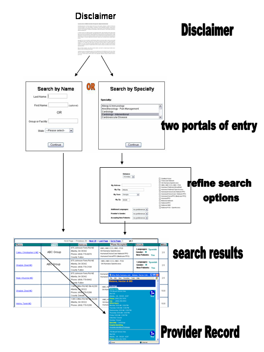
Here is the paper prototype that was tested with the users June 5 – 9th, 2006. The prototype is designed to address issues discovered during the evaluation, and to test those recommended changes. The first change being tested is having the home page offer two portals of entry: name search or specialty search, with the emphasis on OR. The search box fields have been limited to just the name. The ability to refine the search has been moved to the front of the search. Enhancements to the results page is the addition of the group name, plans accepted, and the specialty. Enhancements to the provider record is to include “services” performed.
Start with the disclaimer page:
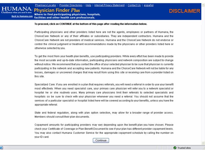 Given that the disclaimer page must be there, there is no other place in the design flow that feels logical or natural for it. By moving it to the front, the disclaimer is satisfied and the process flow of searching for providers is not interrupted.
Clarify what input is needed:
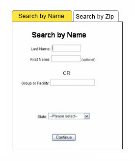 The nature of the search engine is to return an exact answer. Many users unknowingly limited their search criteria by entering too much information. By limiting the the number of fields for the user to input, it keeps the search more broadly based, thus a higher success of returning matched data.
The proposed search page uses a tabbed approach so the user can submit data from 1 tab, or the other tab, but not both tabs.
Put all search options together:
 The current “refine search” has filters available to the user AFTER the initial results are displayed. This is not where users expect more search options; criteria is expected to be offered one time, in one place, before the results are returned. By eliminating “refine search” and moving the filtering functions to the front of the search, it puts all the users’s choices together in one spot, and makes users define the search only once.
Make it easy to see what plans are accepted:
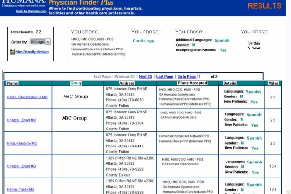 The Physician Finder search results page (not shown) does not show which plans the providers participate in; users must click one additional time on the provider’s name to see what plans they participate in. This is confusing to the user because once they see the name displayed, the natural tendency is to think “There he is, he’s in my network…” but this is not accurate. Without clicking on the provider, you don’t know what plan he’s in.
By moving the participating plans to the results page (shown), it becomes clearer that the provider may or may not participate in all plans.
Keep the information related to the individual doctor:
 The addition of a category called “services” would allow users to see which imaging centers perform mammograms.
Not all information has a place on the results page. Other information like office hours and other locations may be accessed by clicking on the providers name.
Flowchart
Retest with the Paper Prototype Solution
Users were asked to perform the same tasks again on the prototype. The results are that all users:
- found the physicians in the least amount of clicks
- found the physician within three minutes
Conclusion
Overall, users love the HMO website. They have trouble, though, extracting specific pieces of information. During many of the scenarios, the user would ultimately resort to calling the customer service department on the phone because they could not get to the information they needed or wanted:
All users felt it was clear where to begin looking for a provider and all extremely liked the demo for the hospital comparison tool. However, critical observations about PFP reveal a specific problem with users unknowingly limiting their searches, and also unable to locate the “refine option” or the Hospital Comparison Tool.
Major findings are:
- Users unintentionally limited their searches
- Users do not know how to refine a search
- Users fail to find the Hospital tool
- Users give up and call on the phone
Concerning this survey, overall on a scale of 1 (satisfied) to 4 (most dissatisfied) users were generally dissatisfied with a score of 2.86.